

One of the most striking elements of Cinemax’s The Knick—which debuts tonight at 10/9c—is its electronic score from Cliff Martinez. It’s purposefully anachronistic, and crucial to the series’ disorientation. It never wants you to feel entirely comfortable in this early 20th century world, which sits on the cusp of scientific progress without being able to fully embrace it. The score, working alongside Steven Soderbergh’s cinematography, works to disrupt the viewer’s sense of immersion while simultaneously drawing the viewer in on more complicated terms: it’s a great score, and a beautiful show, but The Knick is not something one luxuriates in.
This creates a somewhat complex set of parameters for the marketing around the series, one that has been translated into a campaign by Campfire Media, whose work for Cinemax, HBO, and A&E I’ve written about on the blog in the past. The “At The Knick” campaign mirrors elements of those previous campaigns, particularly the Game of Thrones Westeros Revealed scent box; ahead of The Knick’s premiere, Cinemax has delivered customized medical kits meant to transport the recipient back to a different era of medicine. Meticulously crafted, it’s a beautiful and compelling piece of transmedia worldbuilding, although one that works best as an introduction to rather than representation of the world in the series.
I had seen two episodes of The Knick ahead of the series panel at the Television Critics Association’s summer press tour, where Steven Soderbergh, the series’ creators Jack Amiel and Michael Begler, and members of the cast held a formal panel for the series. This is typically the structure of how things work within the space of television criticism, at least with shows that debut in traditional patterns: episodes are screened, some form of press—whether a press tour panel or a series of phone interviews organized separately—takes place where journalists can gather more information, and then coverage of that show is written based on those experiences.
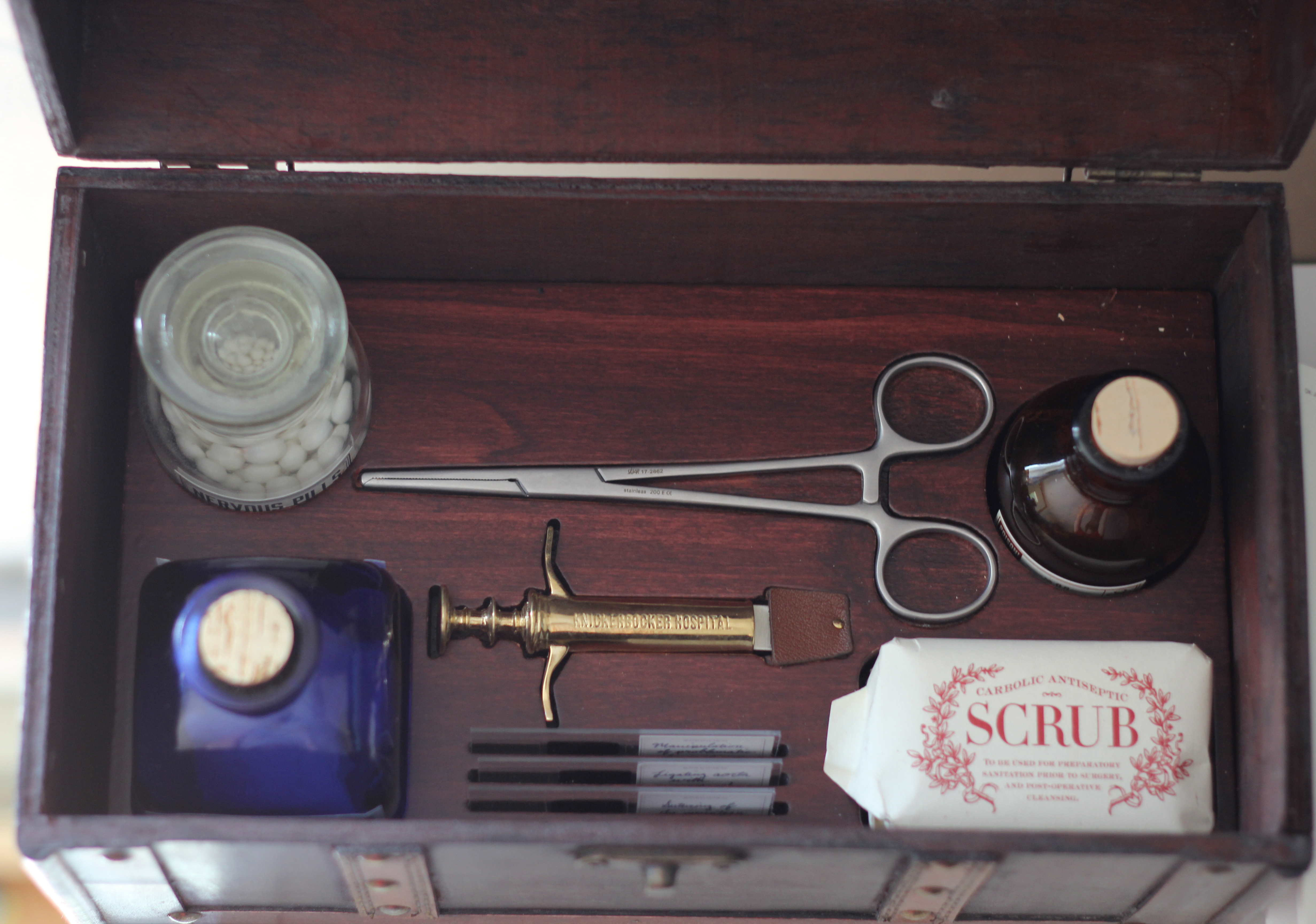
Accordingly, I came to the Knick medical kit from a different position than most of its imagined users, having seen two episodes of the series. This puts me in a position to judge how well the box captures that world, which would have been the primary task for Campfire in designing the box to meet Cinemax—and the producers’—standards (and one imagines Steven Soderbergh to be a man with exacting standards). And so, as the above notes—and is consistent with Campfire’s work—this lives up to the series’ attention to period detail. The included paraphernalia introduces a range of key ideas that resonate in the series, the faux antique components feature lots of entertaining labels that speak to the strangeness of medicine, and the slides featuring images from different procedures do a nice job of previewing the series’ commitment to making its audience sit through some unpleasant-looking procedures of the time.
Slideshow – The Knick Medical Kit [19 Photos]
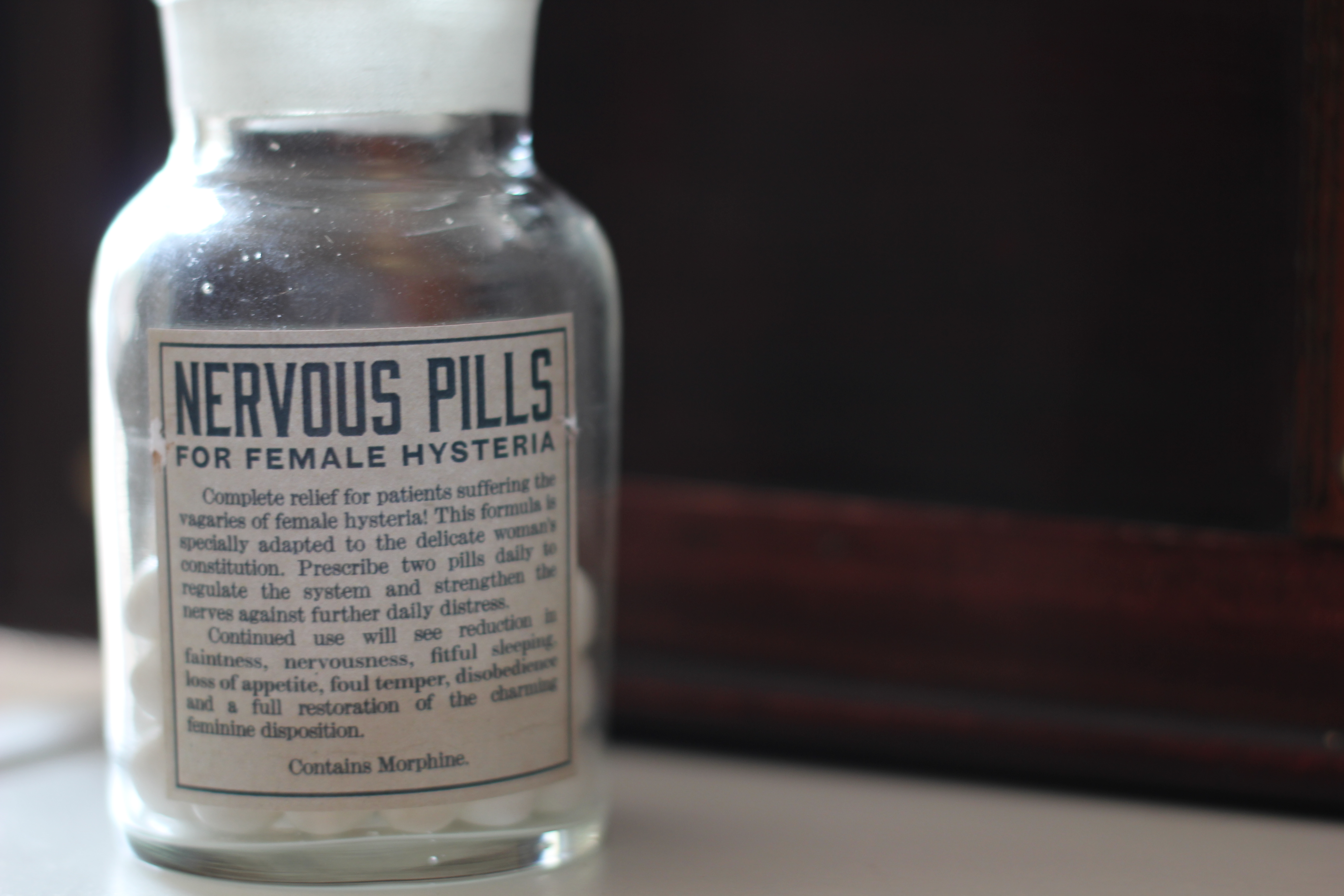
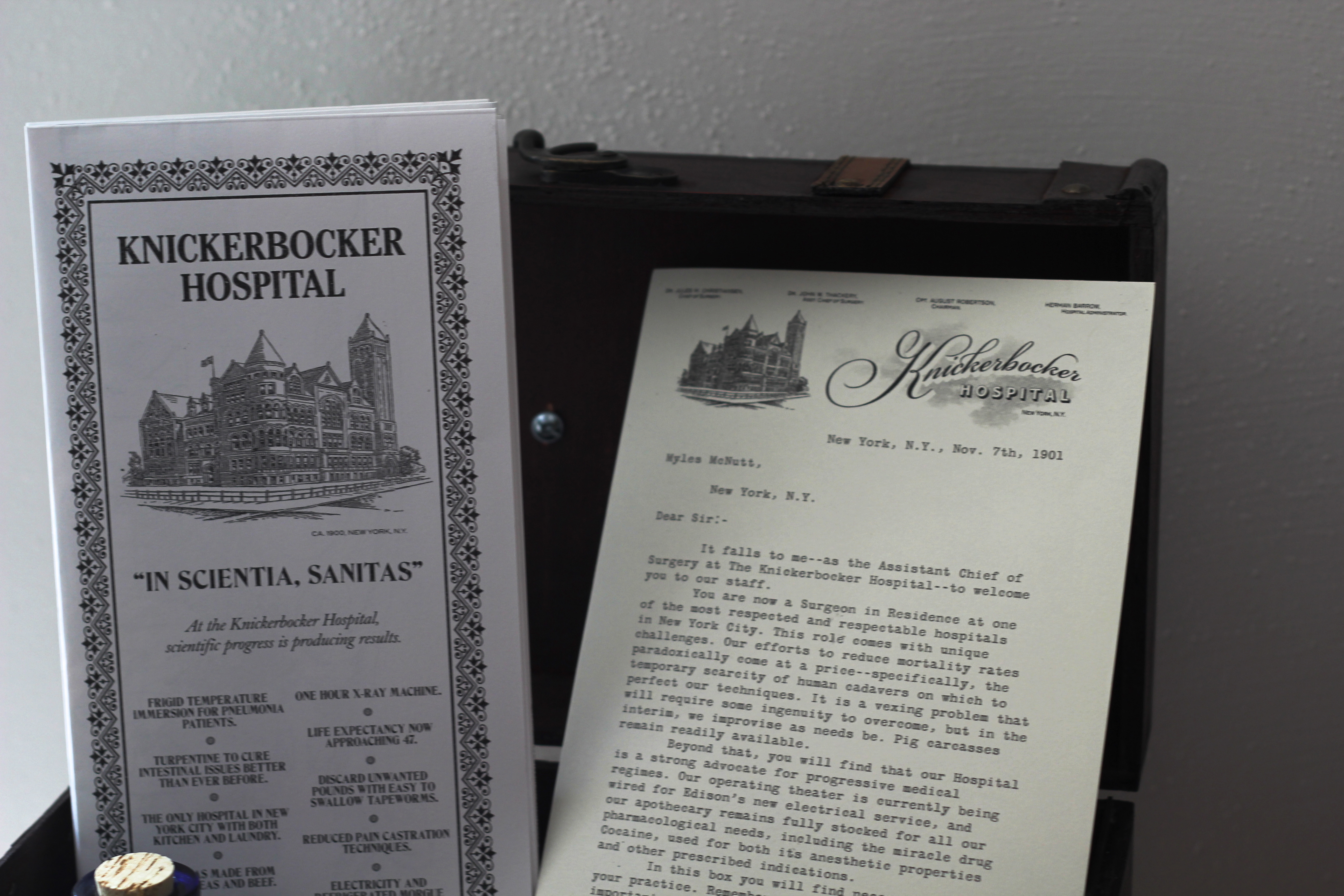
In this way, the box largely replicates the show itself, inviting you in with the promise of authenticity but then giving you reason to wish you could escape back into the world where druggists aren’t selling “Nervous Pills for Female Hysteria.” The brochure that comes with the package boasts of “life expectancy now approaching 47,” and that the Knickerbocker now offers “ample cocaine supplies,” while a refrigerated morgue is “coming soon.” Having seen the show, the brochure and the different bottles represent a nice cross-section of ideas the show itself is playing with, right down to the necessity for the hospital to pitch itself as a business more than a public service.
 Where the box suffers a bit more having seen the series is its need to be inviting to potential viewers (and, in the case of these boxes, opinion leaders who will then want to share the contents to viewers in terms that serve Cinemax’s interests). This is particularly true in the letter that accompanies the box, addressed to each recipient directly and containing a range of details that set up those who haven’t seen the show to experience the box and the pilot that accompanied it. The letter is supposedly written by Dr. John Thackery, the series’ main character played by Clive Owen, and so it can also be read of a preview of the kind of people one expects to meet when watching The Knick.
One of the details that was notable about Campfire’s Game of Thrones scent box was that it had no reference to character whatsoever: it was a piece of transmedia worldbuilding, focused on locations and atmosphere as opposed to the various houses in Westeros and the power struggles between them. By comparison, however, there are multiple elements of character in the Knick box, including a pull-out poster featuring central characters (which doubles as the brochure cover). The letter, meanwhile, does not come from a generic member of the hospital staff: it’s—at least for the purposes of the illusion—written by Thackery himself.
And if I’m being honest, the text of the letter doesn’t entirely track with what I know about the character. The Thackery I’ve seen in two episodes of the show doesn’t seem like someone who would write this kind of introductory letter in the first place—there are moments of frankness that indicate the character’s nature more successfully, but the handwritten “Welcome to our circus, Myles!” is way too upbeat for the character’s relatively bleak worldview, to the point where I started searching the box thinking I’d find a clue to suggest that someone had forged his signature on this letter.
 In truth, it’s likely that Campfire wanted a diegetic roadmap of how to experience the box in addition to the one provided by Cinemax, which is much more explicit about the series’ status as a period drama (as opposed to a lived reality, as the contents of the box itself contend outside of the syringe doubling as a flash drive). But exposition reads differently when it’s purportedly coming from a specific character, and so I think it’s a case where the marketing needs of the campaign mesh better with tone and atmosphere more than they do with doing specific character-building work. For instance, the summary offered by Cinemax goes out of its way to emphasize the relationship between Thackery and Dr. Algernon Edwards, the African American surgeon who arrives in the series and faces substantial racism in completing his job, but the box itself really has nowhere to explore that issue (although the Female Hysteria pills certainly speak to the gender dynamics of the time).
Campaigns like this one don’t need to do everything: by creating a detailed artifact of this world, Campfire has captured much of the series’ sense of time and atmosphere, generating an item that can both stand on its own and stand alongside the series’ pilot. At the same time, though, it can only stand alongside the series for so long, a teaser that will eventually be replaced by a more complex, character-inflected presentation of this period in medicine in the series itself. It begins as an artifact that helps create meaning for the series, but its ultimate meaning as an artifact is determined—and on some level perhaps diminished by comparison—by how watching the show (or not watching the show) shifts its meaning over time. As someone who had seen two episodes, I went into the box differently than someone who had seen zero, just as someone who went into the box without having even seen a trailer for the show had less context than someone who had done significant research on the series before the box and the pilot arrived on their doorstep.
These diverse range of opinions means that the ultimate effectiveness of the box will vary: “impact” for a campaign of this nature is technically based around how many people who receive the box—myself included, obviously—write about it and engage with it on social media as the letter from Cinemax politely suggests. But how well the box sticks with those who experience it is a different question, and one that was foregrounded for me given my pre-existing relationship with the series creating a different evaluative framework than if I was going into the series without any knowledge. The points of inconsistency I observed were distracting for me, but they might have been a meaningful point of discovery for a new viewer when they watched the pilot, the box’s relatively character-neutral perspective creating room for surprise when the recipient watches the series and discovers a richer storyworld than the one capable of being communicated through artifacts of this nature. There’s no way for a single object to prepare for every possible perspective, which made the box less effective for me and potentially more effective for others.
Where Campfire continues to excel, though, is in creating experiences that resist the inherent ephemerality of marketing initiatives. Technically, the box’s goal is to drum up interest in The Knick, but the kind of coverage these boxes receive has a chance to live on compared to traditional ads, and the box also physically persists on the bookshelves of the people who receive them. For my purposes, I’m excited to be able to have these on hand when I discuss transmedia and paratexts with students in the future, giving them a chance to see campaigns like this first hand rather than simply reading posts like this one.


Thanks for writing this, Myles, and sharing your unique box experience. As someone else on Dr. Thacker’s welcome list, I was initially pretty thrilled to be getting one of these medical boxes, on account of how silly and extravagant it seemed. This was my first time receiving a Campfire item, so as I giddily tweeted a photo of the big dumb box a studio sent to me with my initials on it, I was fully aware that by exposing my (rather small) Twitter following to the box’s existence, its purpose as a promotional product was being served. Of course, I told myself, I wouldn’t let the existence of this silly thing influence my writing about the show in any way…but surely I could still have some fun in showing it off a bit, right?
Leafing through the provided material was like having my own little physical cornucopia of those “geez, isn’t it crazy how different times were back then?!” moments that all period dramas, from Mad Men to Master of Sex, indulge in during their infancy. I rolled my eyes at the “female hysteria” mints (too soft, flavour fades fast: 2 out of 5), and Thacker trumpeting that “Edison’s new electrical service” would be gracing the hospital. Like the groan-inducing gag with the Picasso paintings in Titanic, when you deliberately hold up outdated period details to the viewer so they can revel in just how anachronistic they are, you risk treating your period as a gimmick. I was relieved that the pilot didn’t go for many such moments (Thacker’s cocaine use, medically and personally, I thought was handled nicely matter-of-factly), and felt comfortable that I had escaped the exciting allure of the box (*insert “Homer Goes to College” clip here, soon*) having deepened my appreciation for Campfire’s craftsmanship, but not the show.
Anyway, in light of reading your post, what I hadn’t considered was one subtle way the box did wind up influencing my viewing experience of the pilot (I’m choosing to watch week-to-week for review purposes). What proved to be most impactful item without me even realizing it was the included hospital map. I thought it looked neat after a cursory glance, but it wasn’t until reading your piece that I realized the map may have subconsciously assisted my comfortability with the geography of the Knick’s pilot. Like most other writers, it’s Soderbergh’s direction that’s left me most excited about seeing more of the show. In writing about the pilot, I made sure to credit him with how well he established the spatial context of the hospital; I didn’t know where, exactly, any given hall led, or who’s office was next to which ward, but I felt like I had a feel for the place by hour’s end. For all I know, just glancing at the map for a few minutes may have helped nurture that feeling, and massaged a viewing component that would have otherwise not existed, into a tiny plus in the show’s corner.
While the character inconsistency of Thacker’s letter didn’t bother me the same way as it did you (maybe it’s a filter in my brain, but anytime a fictional character addresses me, I always read it as marketing speak, and therefore, as non-representative), the very existence of the box did have its effect on me in ways I didn’t expect. As you said, we all approach the box from different perspectives, so thanks again for opening up about your experience with it. This sort of marketing is an element of television journalism that could use more analysis like this.